
Buying a car no longer starts with a test drive — it starts with a tap. People explore, compare, and fall in love with cars before they ever touch a steering wheel. In this world, a dealership’s website is its first handshake. Yet too many automotive sites still feel stuck in another decade: clunky menus, confusing configurators, and pages that treat specs like storytelling. In this article, we’ll look at how leading brands turn browsers into buyers — and what design choices set those standout sites apart.
The Market Right Now: What Changed and What Keeps Changing
The automotive digital market is being pulled in several directions at once, and none of them can be quietly ignored.
The most visible shift is the move toward direct-to-consumer sales. Tesla proved that a dealer network isn’t a prerequisite for moving cars — the entire cycle from configurator to payment closes on a single website.
Lucid Motors, Rivian, and in Europe, Polestar, followed with their own versions of the same model. Volkswagen Group and Stellantis launched online sales in select markets, but with a hybrid approach: the contract is signed online, the dealer handles last-mile logistics.
The second shift is the deep overlap between automotive and enterprise IT. Companies like DXC Technology — whose website covers the full stack of digital solutions for the sector, from connected vehicle platforms to after-sales infrastructure — are effectively setting the architectural standards for the next generation of OEM and dealer portals. This is no longer “build us a new homepage.” It’s a structural integration between the online customer experience and the manufacturer’s operational backbone.
Third: buyer expectations have been recalibrated by Amazon, Spotify, and Apple. A four-second load time and a search bar with no filters just isn’t tolerable anymore for someone spending €35,000 on a car.
What Good Automotive Web Design Actually Means
Stripped down, automotive web design works when it stays out of the way of the purchase. That sounds obvious, but the vast majority of problems on real automotive sites come from exactly that failure.
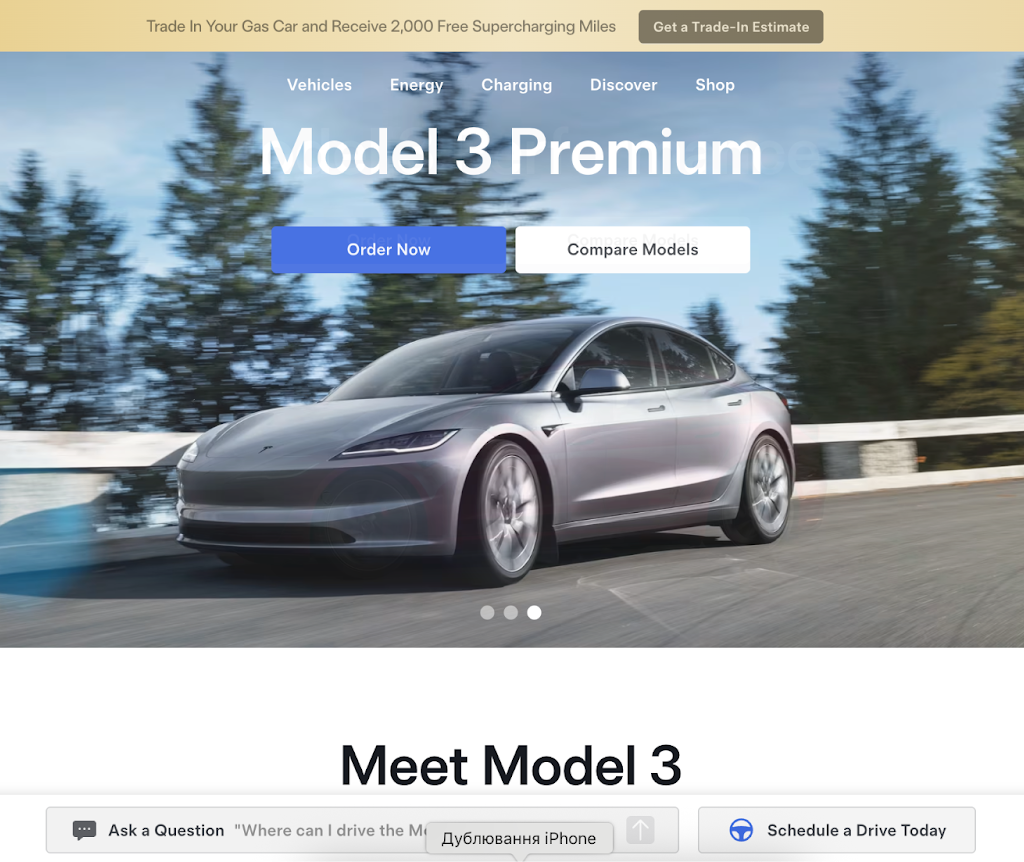
The Hero Section: Emotion and Specificity at the Same Time
The hero has a dual job: it needs to create desire and immediately answer “what do I do next.”
What genuinely works:
- Full-screen video or motion photography — but compressed properly. H.265 with adaptive bitrate over HLS is the current standard, not a raw 80MB MP4.
- One CTA, not three. “Configure” or “Book a Test Drive” — not both presented as equal options side by side.
- The model name plus one number that addresses the audience’s main objection: range, starting price, output.
- No stock photography. A buyer considering a €30K+ purchase spots it immediately.
The Configurator: Where Browsers Become Leads
The configurator is where a casual visitor either converts or leaves for good. It’s also where the most avoidable failures happen:
- A third-party iframe with different fonts and button colors from the rest of the site.
- No progress saving — close the tab, start over.
- No shareable URL when options change. Someone wants to send the color choice to their partner, but the address bar never updates.
- Touch event handling broken in iOS Safari. Hyundai’s own internal audit in 2022 found that a significant share of mobile users dropped the configurator after the first step, traced back to exactly this issue.
Model Pages: Between Storytelling and the Spec Sheet
Model pages are the most-visited page type on any automotive site. The common failure is going all-in on one direction: either five paragraphs of “spirit of the open road” copy, or a raw table with 40 spec rows and nothing else. The more effective approach stacks both — a narrative layer that handles the emotional sell, with a comparison table one click away.
Things that can’t be ignored:
- Real-world video walkthroughs (actual road footage, not studio commercials)
- 360° interior — either Matterport or a WebGL render
- A dealer finder with geolocation built in, not a separate page
- A competitor comparison block — a few brands do this, and it holds attention longer than almost anything else on the page
Auto Website Design in Practice: Projects Worth Studying
Rivian — Adventure as Interface
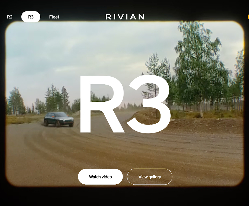
Rivian.com builds everything around the outdoor identity of the brand. Earth-tone palette, R1T and R1S photographed in actual field conditions rather than a studio, clean proprietary typography. The configurator surfaces real-time inventory data from the production pipeline — no “availability subject to confirmation” disclaimers. Core Web Vitals stay consistently in the green, with adaptive lazy loading for gallery sections and a PWA wrapper for mobile.
Polestar — Minimalism as a Position
Polestar.com, built with input from Swedish studio Sköna and digital studio Fantasy, is almost a textbook example of white space as branding. No Honda-style warmth, no Lamborghini aggression — just cold Scandinavian precision where every pixel earns its place.
The standout feature: each model page includes a lifecycle carbon calculator showing the environmental footprint from manufacturing to end of life. Not a UX decoration — a direct answer to the question the target audience is actually asking before signing.
Lamborghini — Making Expensive Look Expensive
Lamborghini.com operates by different rules, and that’s entirely intentional. Dark theme, aggressive scroll animations, ambient audio on model pages in certain regional builds. PageSpeed isn’t in the green zone, and that’s a conscious call — the Huracán buyer isn’t researching on a subway commute. The site uses a subdomain-per-market architecture that gives regional teams room to adapt content priorities. Lamborghini was also among the first OEMs to weave NFT mechanics into the brand’s digital experience, through the Winkelmann-era collaborations.
Mercedes-Benz — Personalization at Scale
Mercedes-Benz.com is one of the more technically sophisticated examples of best automotive website design in the premium segment. After logging in through Mercedes me — the brand’s own identity layer — the site reshapes itself: service history, upgrade recommendations calibrated to actual mileage, accessories relevant to the specific car owned. It stops being a website and starts behaving like a CRM with a browser interface.
Carvana — Used-Car Sales Without the Compromise
Carvana.com is the clearest example of auto website design in the used-car space that has actually changed buyer expectations at scale. Every step from search to home delivery happens entirely online: 360° walkthroughs of each individual unit (not the model, the actual car), credit check without a hard inquiry, VIN-based trade-in valuation, clean title transfer handled digitally. The iconic car vending machine is not a PR stunt — it’s a storytelling anchor that runs through the entire digital experience.
Mobile: Not “Responsive Design,” Just Design
In most major European markets, mobile accounts for the majority of traffic to automotive sites. Germany and France track at 60–65%; in Spain and Italy the number runs higher. Yet most configurators and test-drive booking forms were designed for desktop and adapted after the fact.
Common mobile failures:
- Hamburger menu in the top-right corner — physically unreachable without shifting the grip on the phone
- Forms with 10+ fields and no Apple Autofill or Google Autofill support
- Image galleries with no swipe gesture, replaced by 24px arrow buttons
- Dealer phone numbers as plain text instead of tel: links
What actually moves conversion on mobile:
- Bottom navigation bar with 3–4 core sections — thumb-zone design, not desktop logic pasted on top
- Sticky “Book a Test Drive” button at the bottom of model pages
- Three steps maximum in the booking form: model → date → contact
- Click-to-call on every dealer number, no exceptions
- Haptic feedback in swipe galleries where the Vibration API is supported
SEO and Technical Foundation
A polished automotive website design that Google can’t properly crawl, or that loads in six seconds, is just an expensive failure.
Core Web Vitals in 2024+
Google replaced FID with INP (Interaction to Next Paint) in Core Web Vitals starting March 2024. For automotive sites with heavy JS configurators, this is a real challenge: every interaction — picking a color, switching trim levels — is now measured. The threshold is under 200ms. Most configurators loading synchronous bundles don’t clear it.
Schema.org for Automotive
Marking up Vehicle, Car, and AutoDealer types in JSON-LD unlocks rich snippets in search results: dealer rating, price range, model availability — visible before the click. For dealer networks competing on local queries, this is direct leverage.
Local SEO for Dealer Networks
- Separate landing pages per location with actual unique content (not just “{City} Toyota” as the H1)
- Google Business Profile with real interior and service bay photos, current hours, review responses
- NAP consistency across aggregators: Cars.com, CarGurus, AutoTrader, Autoscout24
- DealerRater review integration directly on-site via API, not just a link out
Quick Checklist: Signs of a Strong Site
Hero and navigation:
- Hero without autoplay audio and without stock photography
- Mega-menu with visual model previews and type/price filtering
- Autocomplete search by model name, VIN, and dealer location
Configurator and model pages:
- 3D or 360° view with working touch handling in iOS Safari
- Configuration progress saved via URL or account login
- Shareable URL that updates with each option change
- Side-by-side trim comparison for up to three variants
Mobile:
- Bottom navigation or sticky CTA on model pages
- Test-drive booking in three steps or fewer
- Click-to-call on all dealer numbers
Technical:
- LCP < 2.5s, INP < 200ms, CLS < 0.1
- Schema.org Vehicle and AutoDealer in JSON-LD
- Images in WebP or AVIF with srcset
Where Automotive Website Designs Are Going Next
The new generation of automotive website designs being built right now represents a genuinely different level of interaction.
Conversational configurators. Instead of clicking through option menus, a text or voice prompt: “Family electric crossover, dark exterior, no premium audio pack, under €45K, home charging available.” AI surfaces two or three matches from real nearby dealer inventory with immediate reservation capability. Volkswagen Group Innovations demonstrated a working prototype of this in 2023 using the ChatGPT API as the backbone.
Gaming-space showrooms. BMW and Genesis have both run activations inside Fortnite and Roblox — full 3D showrooms embedded in the game. Polyphony Digital has spent years showing, through Gran Turismo 7, what a digital automotive showroom looks like when material fidelity and light behavior actually matter. The logical next move is bringing that experience into the browser via WebXR — no game launcher required.
VIN-level personalization. An owner arrives at the brand’s site after logging in and sees their specific recall status, service recommendations based on actual mileage, and a trade-in valuation drawing on CarFax records and current Edmunds market pricing. Not a “welcome back” banner — actual context.
Voice-first search. Voice queries in the automotive category tend to be long and conversational: “fastest-charging electric car under £40K that handles motorway driving well.” Optimizing for those patterns is a separate discipline, and the brands investing in it now are building an advantage that won’t be easy to replicate in 12 months.
Final Thoughts
Good automotive website designs are not about looking impressive. It’s about making sure that someone who has spent three months researching a purchase gets every answer they need online and reaches the dealership (or the checkout) without unnecessary friction. Rivian, Polestar, Mercedes-Benz, and Carvana each demonstrate a different model: emotional pull, precision minimalism, personalized CRM-style experience, frictionless online transaction. What they share is a single starting point: the buyer’s journey comes first, not the marketing team’s convenience.
The tech stack is the means, not the goal. WebGL, headless CMS, PWA, AI configurator — all tools. The real problem on most automotive sites isn’t that they’re not using Three.js. It’s that the test-drive booking form has twelve required fields and doesn’t recover from a dropped connection.